

I can’t believe how much the scope of cannabis branding has changed in the last few years!
When we first created this list (2016), it was a struggle to find even 12 examples of marijuana brands with consistent, high-quality branding. Now (2020) it’s hard to narrow them down to just 18!
As the cannabis industry grows, so does the demand for unique branding designs. These companies are leading the way, proving that quality cannabis branding is well worth the time and effort!
THESE 17 CANNABIS BRANDING DESIGNS REALLY STAND OUT:
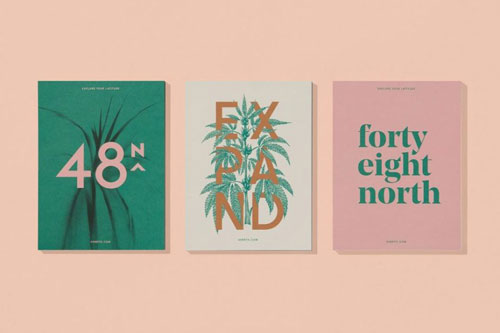
48 North
48 North combines a subdued color story with simple line-work that feels natural and modern, but playful when necessary. Their packaging is clean, and looks almost like something you would pick up at a pharmacy, other than the occasional bright color block to catch the eye.
Logo: Modern, minimal
Graphics: Color blocks & illustrated line art
Font: Modern san serif in bold & thin
Color:Muted earth tones
Packaging: Minimal with bright color accents
Product: Varies

Altai
With geometric cuts and colorful paint-like smears on their chocolates, the Altai brand almost feels like an art installation. When combined with the identity design and logo, their overall branding creates a creative, rustic appeal that is both youthful and classic.
Logo: Tribal, stencil-style
Graphics: Floral, earthy
Font: Classic serif, accented by bold & san-serif
Color: Gold, browns, and reds
Packaging: Light, retro and earthy
Product: Geometric shapes, splatter paint color
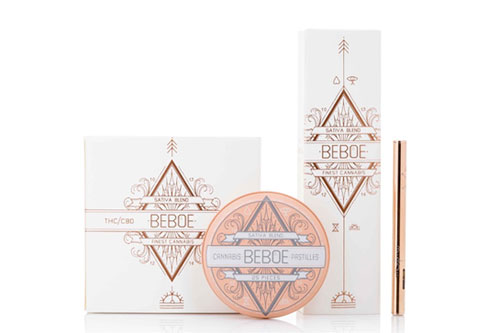
Beboe
A very decorative brand, Beboe rocks a Victorian-meets-New-Age style and a very colorful palette. Its simple wordmark is surrounded by an ornate line-work pattern, while their use of color & graphics tie together into a highly sophisticated cannabis brand.
Logo: Wordmark with line art embellishment
Graphics: Ornate, with new-age style symbolism
Font: Bold, geometric san serif
Color: Gold, pink and white
Packaging: Elegant and decorative
Product: Varies
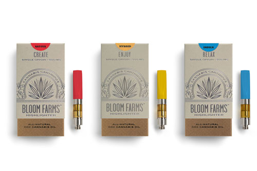
Bloom Farms
Bloom Farms’ brand is hard to forget, despite its perceived simplicity. Starting with a clean, yet decorative leaf logo & a tall, stately wordmark, their aesthetic is otherwise clean and effortless. The result is a brand that screams high-class, all the way down to the little flourish on their vape batteries.
Logo: Elegant leaf & wordmark
Graphics: Simple and modern
Font: Tall, thin san serif
Color: Primarily white, dark, and gold
Packaging: Classic with modern cutouts
Product: Sleek & elegant, with fun color accents
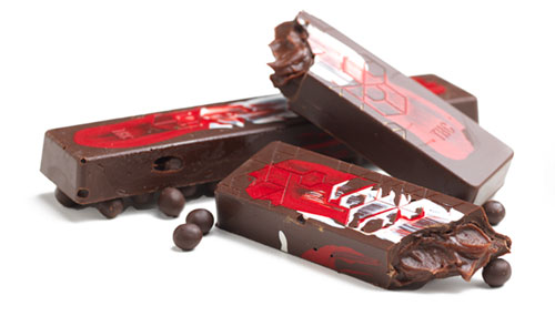
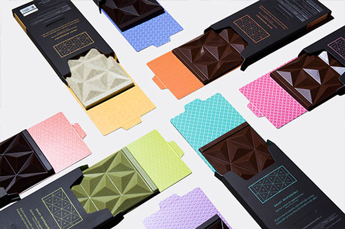
Défoncé
Combining black, white and gold with strategic hints of bright colors, Défoncé’s brand is both elegant and fun. The marijuana-infused chocolate company uses playful geometric shapes in their packaging and on the chocolates themselves, so each product has an identity all it’s own!
Logo: Capitalized wordmark
Graphics: Minimal, pattern-based
Font: Modern san-serif, accented by cursive
Color: Black, white & gold, color accents vary between products
Packaging: Modern, clean & playful
Product: Geometric shapes
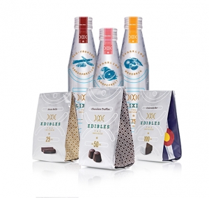
Dixie Elixirs
The Dixie brand is a beautiful example of how branding doesn’t need to restrict your design. By applying their heavy use of line and pattern, they’ve been able to create products- and even packaging- that are different in every way, while still upholding a seamless unity that fits within the same brand design.
Logo: Line-styled typography
Graphics: Eccentric patterns
Font: Varies between products
Color: White & silver, color accents vary between products
Packaging: Simple & clean, with varying color accents
Product: Designed on an individual basis
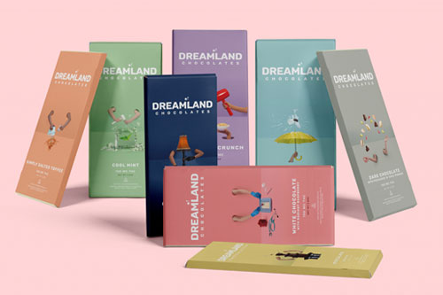
Dreamland
The definition of a brand that’s light and fun, Dreamland’s lively graphics and color story will make you feel as if you’ve been transported to, well… a dream. They combine all of the necessary elements perfectly, between the whimsical photography, charming graphics, and bold use of color.
Logo: Wordmark with playful embellishments
Graphics: Color blocks, bold & cheerful artwork
Font: Capitalized & standard san serif
Color: Rich pastels
Packaging: Cheeky graphics that differentiate flavors
Product: Simple, with clear edible warning
See Dreamland’s branding in action at dreamlandchocolates.com
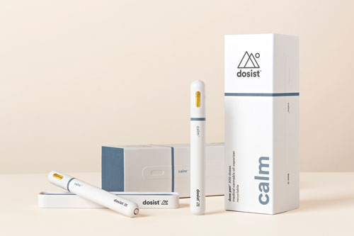
Dosist
A brand so modern, it almost feels futuristic. Every aspect of Dosist’s presentation is minimal, yet powerful. Between the clean photography, sharp packaging, strong typography and bold splashes of color, nothing feels excessive nor timid.
Logo: Minimal double triangle design
Graphics: Modern, branding centers on color blocks & photography
Font: Bold and regular san serif
Color: White base with strong, matte colors
Packaging: Minimal and approachable
Product: Sleek & modern
Electric Lettuce
Going all in on their groovy ’60s psychedelia vibe, Electric Lettuce succeeds in making us want to go back in time. You can spot these dispensaries easily; their exteriors are all painted with vibrant and eccentric graphics, seemingly inviting you down the rabbit hole.
Logo: Playful but minimal icon
Graphics: Colorful & abstract
Font: Retro slab serif paired with tall bold serif
Color: Purple, blue, orange & yellow
Packaging: Not applicable
Product: Not applicable
See Electric Lettuce’s brand in action at electriclettuce.com

Ionic
A strong example of “masculine” branding, the Ionic vape brand combines a simplistic logo, bold color scheme, and power-shot photography to create a look that commands attention from the market.
Logo: Two-dot design with versatile use
Graphics: None, branding centers on photography & logo
Font: San-serif, mix of capitalized and standard
Color: Red, black & gold
Packaging: Sleek, minimalistic
Product: Simple & clean
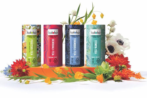
Kikoko
This cannabis branding design does a great job of combining a vintage quality with a modern aesthetic, while really making it artistic & fun. Kikoko isn’t afraid of going a little crazy with color, patterns, and mixed media graphics, which makes the brand feel cool enough to hang out with.
Logo: Bold, minimal
Graphics: Colorful & vaguely abstract
Font: San serif, bold and thin
Color: Bright & vibrant
Packaging: Colorful shapes & patterns
Product: Varies
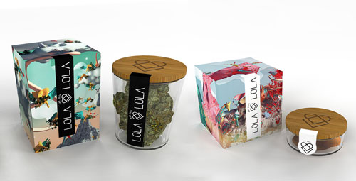
Lola Lola
This up-and-coming brand obviously strives to stay creative and fun, and it shows in everything they produce! Their playful use of 3D elements, geometry, and bright pastel colors build a very retro appeal while still maintaining a modern look and feel, making Lola Lola a marijuana brand all its own.
Logo: Color-alternating typography
Graphics: Geometric, environmental
Font: Retro san-serif
Color: Bright, vibrant colors
Packaging: Creative, modern
Product: Natural (cannabis flowers)
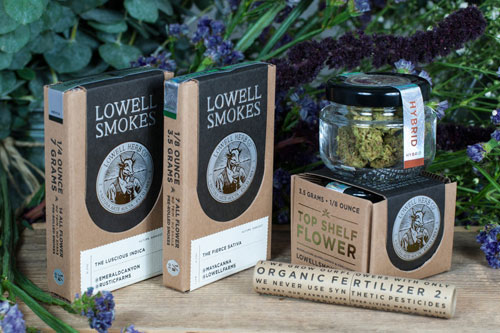
Lowell Herb Co
Reminiscent of an old cigar brand, Lowell Herb Co succeeds in exuding a dignified, masculine energy. But there’s nothing flashy about this cannabis brand; their subdued color palette and classic package design makes them feel authentic, trustworthy and expensive.
Logo: Vintage stamp
Graphics: Classic / vintage illustration
Font: Classic serif, modern san serif
Color: Natural browns, charcoal & white
Packaging: Reminiscent of old cigar or tobacco box
Product: Simple, streamlined
Tokyo Smoke
Tokyo Smoke balances geometric elements with more feminine & soft components to create branding that is both modern and delicate. Their interesting tricks of light, reflection, and color in 3D work to create graphics that feel very flowy and ethereal, a distinct part of their identity.
Logo: Modern & minimal
Graphics: Geometric 3D art
Font: Short san serif
Color: Soft colors and chromatic gradients
Packaging: Modern, minimal, abstract
Product: Varies
Van der Pop
With bright, playful pops of color, Van der Pop succeeds in coming across as a fun and fresh self-care brand without worrying about the stigma. This cannabis brand is obviously is love with nature, with floral graphics and photography that feel lively, funky and feminine.
Logo: Geometric logo with modern wordmark
Graphics: Cut-outs and floral illustrations
Font: Feminine serif, with bold san serif
Color: Mainly pink & purple, paired with other bold colors
Packaging: Fun and creative
Product: Varies
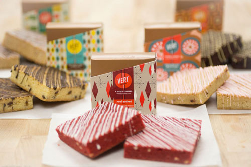
Vert Edibles
This edible company seems like its trying to have a good time and not take itself too seriously. Vert’s creative use of patterns and colors makes each of their packages feel like a gift to be unwrapped.
Logo: Bold
Graphics: Geometric patterns, color blocks
Font: Mix of serif and san-serif
Color: Soft and bright colors
Packaging: Artistic and colorful
Product: Varies
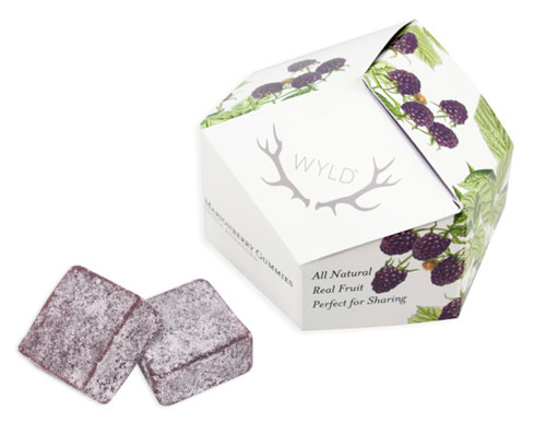
WYLD
A very naturalistic brand, Wyld has successfully combined realistic illustrations with modern appeal. Their identity is unique and memorable, while their packaging is designed to make the product feel both intriguing and familiar.
Logo: Modern
Graphics: Illustrative
Font: Mix of serif and capital san-serif
Color: Soft, natural colors
Packaging: Geometric w/ minimalistic imagery
Product: Varies in color and shape
This post was written to celebrate cannabis branding throughout the industry, and as such we’ve deliberately left out brands that our agency has designed. Check out the KindTyme cannabis brand design portfolio to see how our style compares to the brands listed above!
Tyler Elson
Posted at 09:30h, 17 FebruaryThanks for featuring our WYLD gummies!