

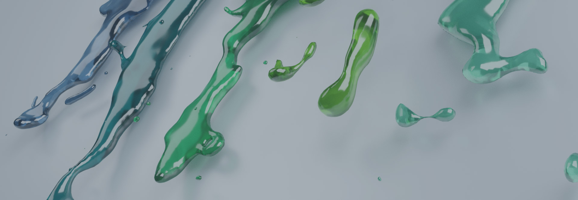
Color and Cannabis Brands: How Color Scheme Affects Marketability
Take a minute to think of the following brands: McDonalds. Macy’s. Your favorite football team. What is the first thing that comes to mind?
For most, the answer is the logo and/or color scheme. These two play a huge role in any brand, so they are the elements that people remember the most.
Since I’ve already discussed the intricacies of marijuana logo design in a previous article, now is a good time to examine how- and why- colors play such an important role in branding your cannabis business.
What is color theory?
Designers and artist spend their whole lives studying color. But all of us started with a critical foundation to understand color, so we can understand how it effects our designs. In this way, learning the basics of color theory will give you the ability to create a color scheme that will work really well for your business.

Color is essential in branding not only because it helps create excellent design, but also because it gives your business an identity. Without color, your brand would look muted, cold, uninteresting and impersonal.
But when used appropriately, color emphasizes what matters, giving your brand a personality and helping you attract the right audience.
Understanding the Color Wheel:
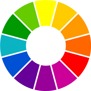
If you’ve ever taken an art class, you are probably familiar with the color wheel. It was designed to organize colors in a way that makes it easy to generate color combinations. The color wheel has 3 primary colors: red, yellow and blue.
When combining two of the primary colors, we get the secondary colors: green, orange and purple.
When combining the primary and secondary colors, we get the tertiary colors: red-orange, yellow-orange, yellow-green, blue-green, blue-purple and red-purple.
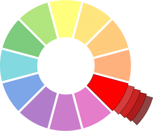
Yet when looking at a color scheme for your cannabis business, you aren’t limited to these 12 colors. Every color has hundreds of light, dark, and varying color combinations. This is where the three attributes that affect color- hue, saturation, and value- come into play:
Hue: Hue is a term that is interchangeable with the word “color”.
Saturation: Saturation is the intensity of a hue. When a hue has high saturation it is vibrant and rich looking. When it has low saturation it looks muted and dull.
Value: Value is the lightness and darkness of a hue. Value allows us to create contrast and differentiate colors.
If you have a color scheme that looks off, or doesn’t fit well with your brand, changing one or more of these attributes can unify a color scheme.
Creating Color Harmonies:
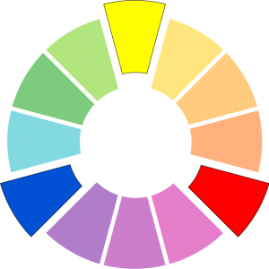
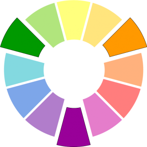
Color harmonies are standards that designers use to make combining colors easier. It may sound complicated, but really color harmonies just refers to colors that naturally look good together. These are often categorized on the color wheel, based on an individual color’s placement in comparison to others’.
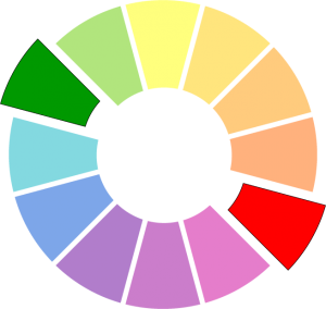
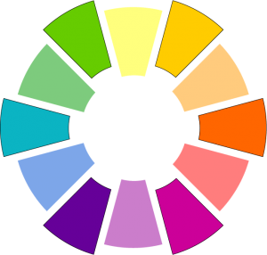
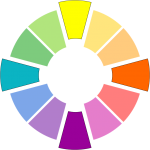
Complimentary: Complimentary colors are two colors that are opposites. They have the highest contrast between them. When combined they will neutralize and create gray.
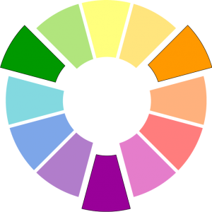
Triad: A triad color scheme is 3 colors evenly spaced out on the color wheel, creating an equilateral triangle.
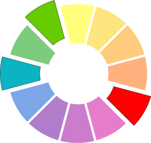
Split Complimentary: Like complimentary colors, split complimentary starts with a base color and “splits” at its complimentary color, using the two colors of either side of the complimentary color.
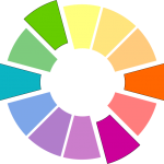
Tetrad: A Tetrad is two sets of complimentary colors, making a square or- when two complimentary colors are close together- making a rectangle.
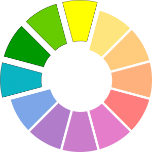
Analogous: Analogous color schemes are colors that are next to each other on the color wheel. This kind of color scheme usually has good rhythm.
Monochromatic: A monochromatic color scheme uses one color from the color wheel, with varying values and saturations. This color scheme often appears calming.
What do Colors Mean for Your Cannabusiness?
It is essential to know more about color to create effective color schemes. But it is also important to know what a color says about your brand. Like all other aspects of a brand (logo, typography and voice), colors influence consumers psychologically.
So the next question you should be asking yourself is:
What does this color scheme say about my cannabis business?
Keep in mind that colors can mean many things to different people and cultures. But there is a standard of how colors typically affect consumers, which is important to know when selecting a color scheme that will represent your brand.
There are an excellent number of resources online about the many meanings of colors, but here a some general guidelines:
![]() Red: Bold, High Energy, Aggressive
Red: Bold, High Energy, Aggressive
![]() Yellow: Fun, Happiness, Wisdom
Yellow: Fun, Happiness, Wisdom
![]() Blue: Trustworthy, Calming, Cold
Blue: Trustworthy, Calming, Cold
![]() Purple: Creative, Wealthy, Royal
Purple: Creative, Wealthy, Royal
![]() Orange: Warm, Social, Enthusiastic
Orange: Warm, Social, Enthusiastic
![]() Green: Earthy, Growth, Reliable
Green: Earthy, Growth, Reliable
![]() Brown: Dependable, Honesty, Friendly
Brown: Dependable, Honesty, Friendly
![]() Black: Powerful, Authority, Sophisticated
Black: Powerful, Authority, Sophisticated
![]() Gray: Neutral, Stability, Subdued
Gray: Neutral, Stability, Subdued
![]() White: Pure, Clean, Simple
White: Pure, Clean, Simple
Note that a color by itself can mean one thing, but putting one color next to another can drastically change the interpretation of a color pallet.
For example: green is reliable, fresh and earthy. Red is vibrant, bold and energetic. But when combined, they can make your brand appear like a Christmas company- which likely isn’t what you were going for.
This brings us to Color Association.
Color association refers to the fact that people will subconsciously associate certain colors with other things in life. If your brand’s colors remind people of something else, it can be harder to get your message to stick out in their minds.
This is why many cannabis brands use the color green and purple, due to it’s relation to the marijuana plant.
But doing so can be both a blessing and a curse. It’s true- using green can link your brand as an earth conscious, reliable cannabis business. But this strategy can also fail due to it’s ubiquity in the marijuana market. It can be hard, if not impossible, to stand out when everyone is doing the same thing.
So what’s the best solution? It depends on your brand voice, your market and what your competitors are doing.
It might be more important for your brand that you go with green because you need the association with cannabis. Maybe it speaks strongly your brand message.
If you believe that green is important to your brand, I recommend using the tips in this article to find other colors that go with green and will differentiate you from other, similar brands.
But if uniqueness is priority, it might be a good idea to step out of the box and find other colors that fit your brand message in a more unique way.
If you take away one thing from this article:
Design can’t flourish without knowing how color will impact it. Color is the life force to your brand. It gives it energy and personality. The relationship that your customers build with your business is dependent on a color scheme that speaks to them and keeps them coming back.
Mark Miller
Posted at 13:20h, 10 JanuaryLooking for the correct LED light color to display flower for sale in cases. Can you help or refer me? Thanks in advance.
Tj Saunders
Posted at 06:01h, 28 FebruaryI’ve read quite a few articles on the meaning of colors, how to use them, and organize them. But, I have never seen all of this information in one post.
So much valuable info was given here.
Thanks Sebastian!
Sebastian Dean
Posted at 13:59h, 02 MarchThanks Tj! I’m glad you enjoyed the article!
Throughout my career as an artist I spent a lot of time finding ways to avoid color. Color is deceptively simple but also very complex, and when it comes to applying it to art and design it can quickly get overwhelming. When I started to feel my work was was suffering because of this I realized it was essential to finally get a handle on the subject. My goal with this article was to share what I’ve learned over the years, and to give everyone a jump start on the fundamentals of color so they know how their designs, business and brand are affected by it.
Dan Tutor
Posted at 10:12h, 08 JuneThis took me right back to Light, Color, and Design class, freshman foundation year at Pratt Institute. Im continually impressed with the Kindtyme team! Looking forward to working with you.
Dan
@supernaturalgardens
Sebastian Dean
Posted at 13:10h, 15 JuneThanks Dan, glad you liked the article! The foundations of light and color are so important in every aspect of art and design. We found it essential to share the fundamentals to help nurture great design in the cannabis industry!
Looking forward to working with you as well!
Brad
Posted at 14:33h, 19 JuneThis is a really great wrap-up!! I implemented some of these thoughts into my website.
Sebastian Dean
Posted at 12:31h, 26 JuneThanks Brad! I’m glad that you found this article helpful!