Capital Cannabis is an
Oregon-Based Brand
with National Goals


Capital Cannabis
American flag logo design & packaging for Capital Cannabis.
Prior to launching their flower & pre-roll product line, Capital Cannabis knew one thing: they wanted an American-inspired brand that kept the American flag front-and-center.
American Flag Logo Design
We took the challenge head-on, turning their current American flag logo into an abstract representation of both the brand and the flag.
This badge is one of a few design variations made for Capital Cannabis’s wordmark, but all have the same U.S. flag logo inspiration.
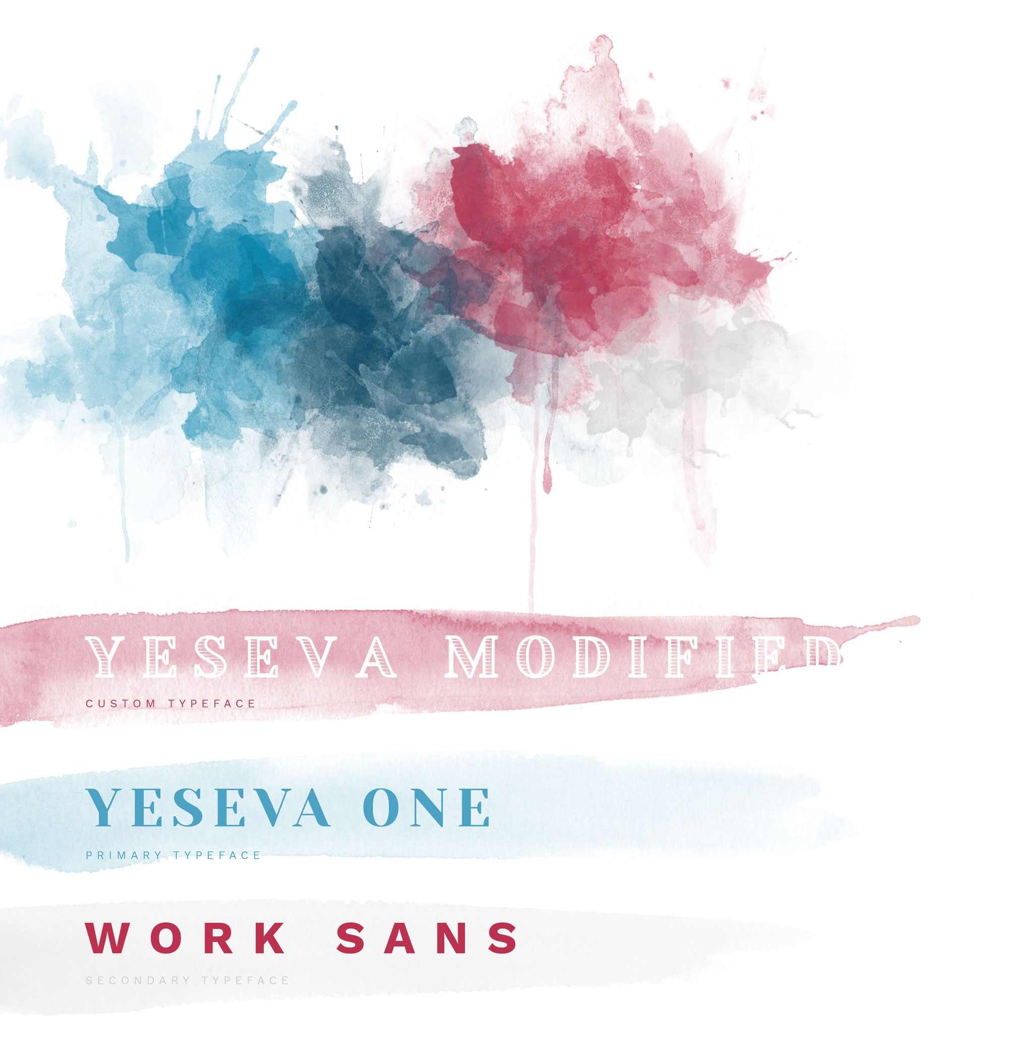
Red White &
Blue Branding
Americans are so accustomed to seeing the American palette, our first question was – how do you make these colors interesting?
For the Capital Cannabis brand, our answer was watercolor effects. But a watercolor logo is tough for any brand to pull off, so we sought out to create a watercolor design that was bright & eye-catching, without causing Capital Cannabis to lose its approachability.
Custom Graphics
We expanded this unique brand identity with a bundle of custom graphics designed for traditional American themes. These red, white, & blue brand icons can be found throughout the rest of their materials, including their website and packaging.
Preroll
Packaging Design
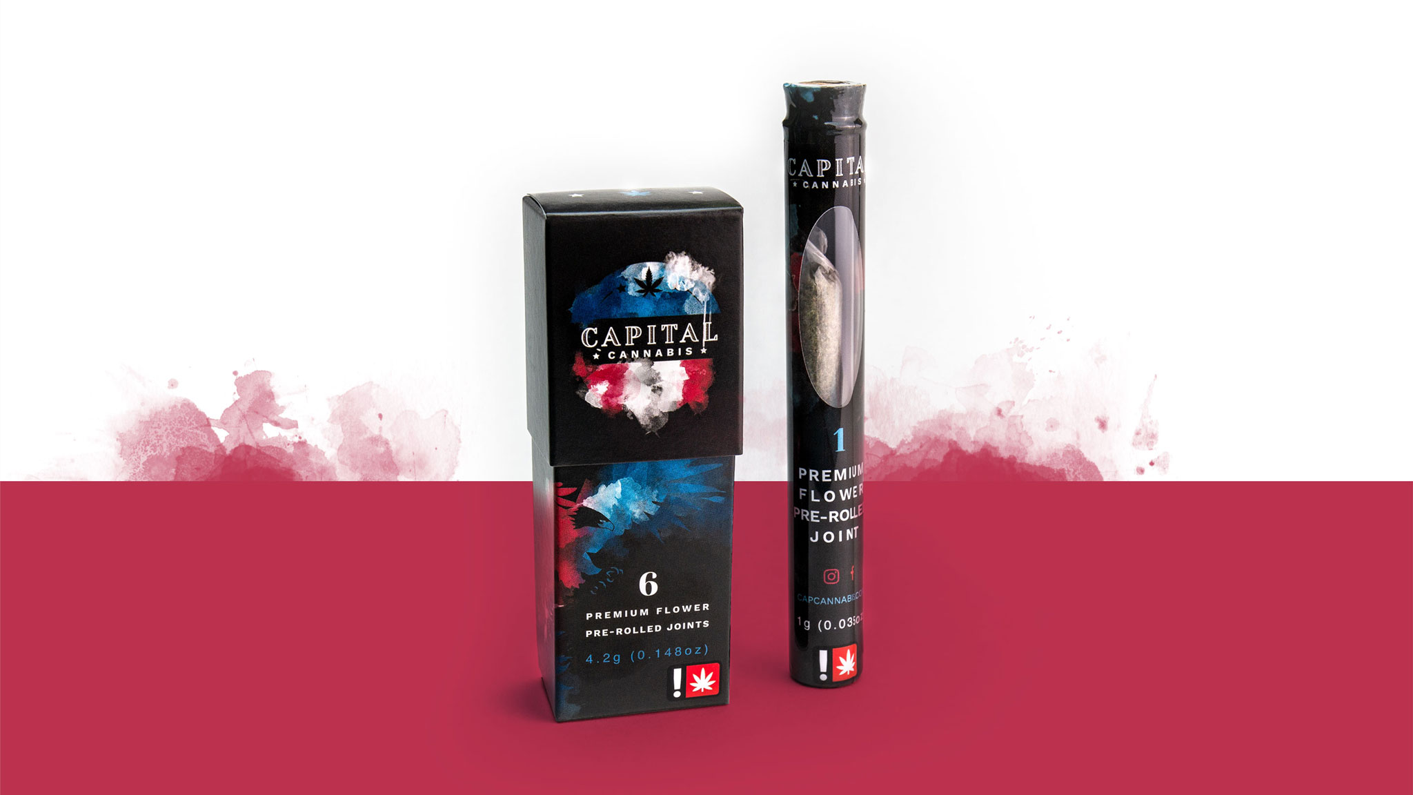
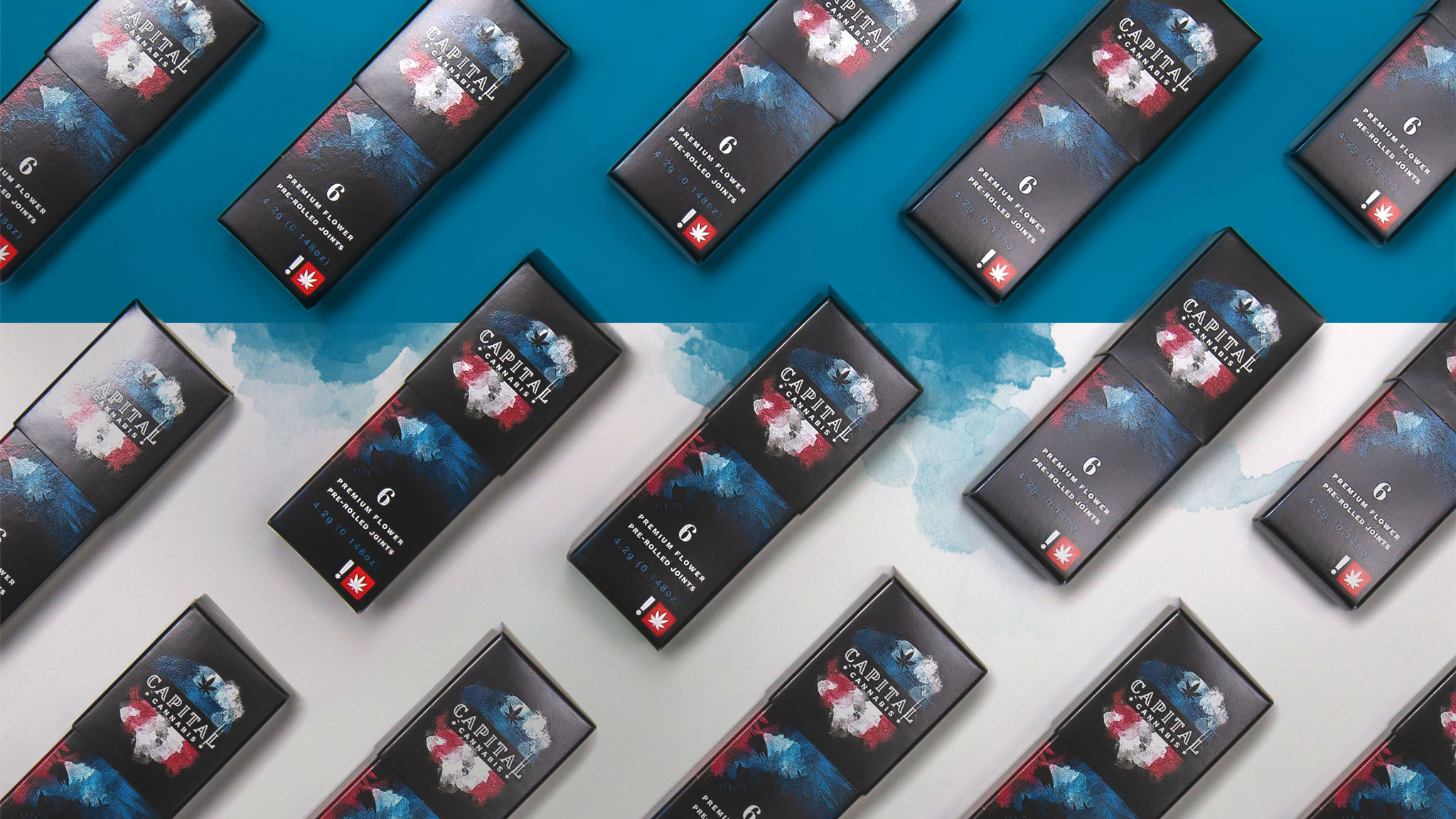
With the watercolor logo and graphics all ready, our team shifted focus to Capital Cannabis’ shelf appeal.
Since they would be offering singles and 6-packs, the Capital Cannabis team needed preroll packaging with versatility. We created a compact preroll box for the 6-pack that’s just the right size for a bag or pocket, and for the single, we designed a shrink wrap label with a peek-through window.
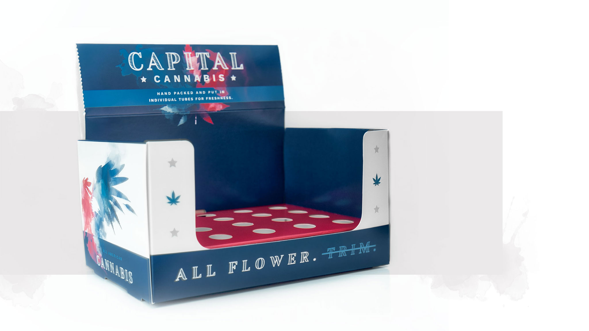
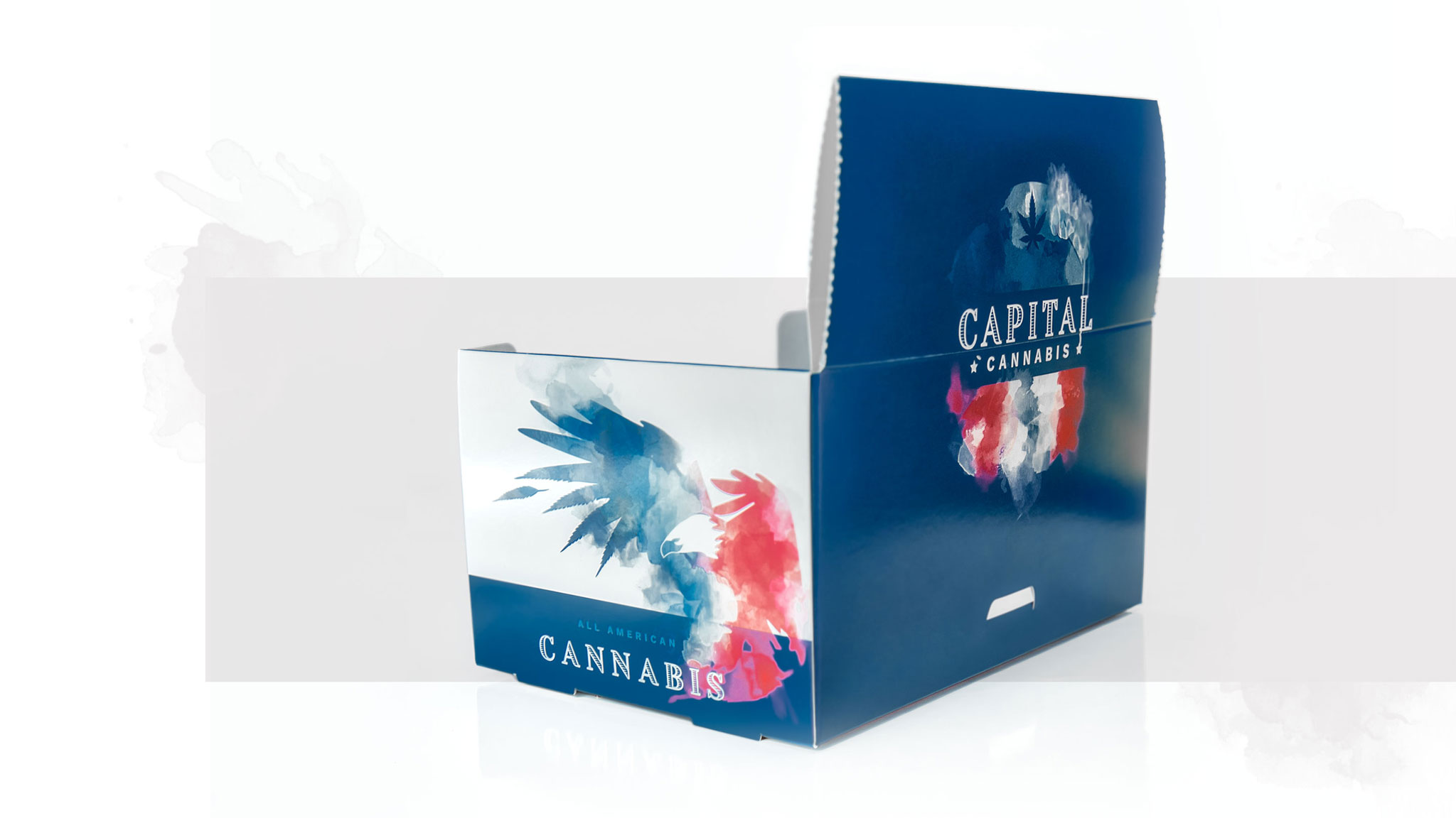
Display
A bold, unique package design is important, but don’t forget about retail presentation!
For their dispensary partners, we designed a portable counter display that lets them show off the preroll packaging or individual tubes by using a removable insert. This display also folds into a sealable box, making shipping and storage almost too easy.
Preroll
Product Launch
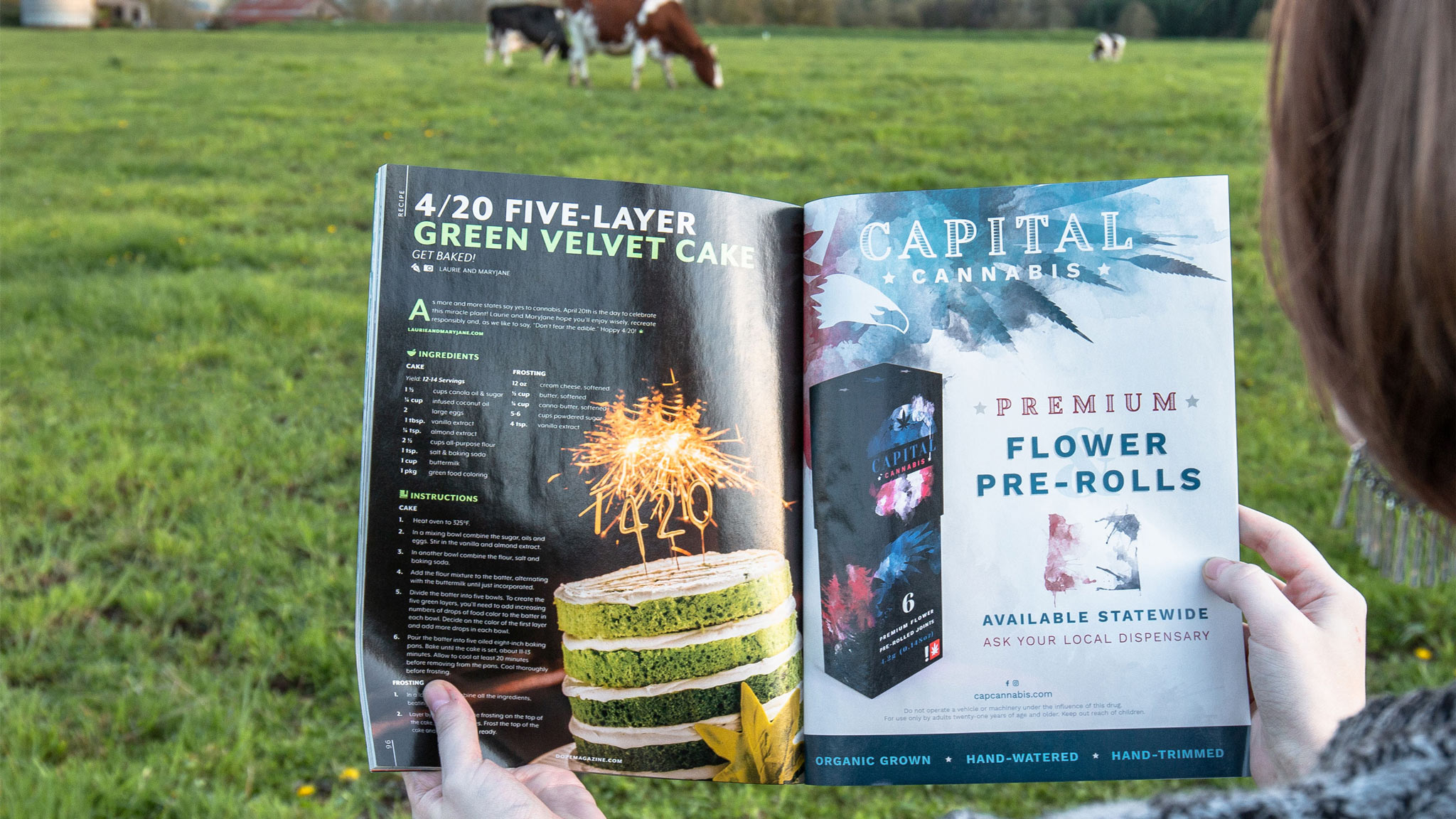
Eager to spread the news about their brand launch, Capital Cannabis had us design a print ad to promote their preroll release. Did you catch this ad in an issue of Dope Magazine, Eugene Weekly, or Cannapages?
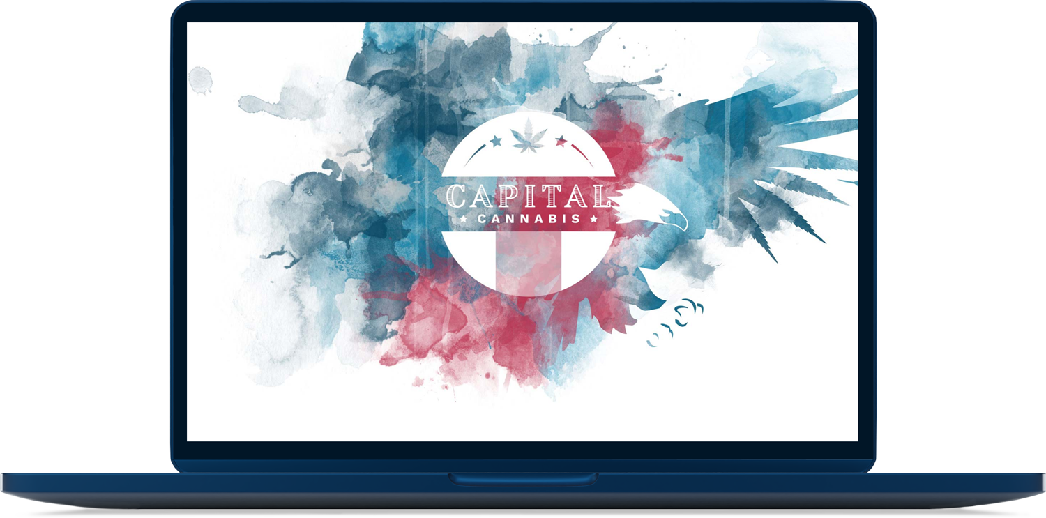
Website Landing Page
As a new business, Capital Cannabis’s goal was a simple, to-the-point website that could grow alongside of them. We created a single page site that shares their basic info, but with a design that makes it hard to look away!