Ohana Canna is a
But before they launched Ohana Canna, this growing team was a group of nature-obsessed, surf-loving friends. They wanted a brand identity that reflected these passions, followed up by a colorful series of promotional items that would draw attention and stand out as a one-of-a-kind brand.
Logo Design
Surfing brand vibes with a sun, mountain, and ocean logo design
Most nature logos are rooted in natural colors, but we wanted Ohana Canna to invoke an authentic lifestyle feel. By choosing a colorful scheme more reminiscent of a surfing logo, and offering two versions with flat, modern design and vibrant, retro tones, the Ohana Canna logo is still inspired by nature – but in a way unlike any other marijuana brands in the market.



Branding
Designing a brand for California surf culture requires a casual appeal with an artistic flare
Surfing brands are anything but boring. They are colorful, inspirational, and always carefree. Since a few of our team members are avid surfers, we drew inspiration from many of their favorite brands and campaigns. The result is an identity that creatively uses color blocks, shapes, patterns, and layered photography for a laid-back, yet forward-thinking, brand design that focuses on nature first.


Layered Imagery
Creating the intersection between nature photography and abstract branding
Ohana Canna was founded on a love of the outdoors, so we wanted to maintain a balance of natural elements alongside the digital art. By fusing landscape & outdoor photography with bold color blocks in unnatural orientations, we were able to create abstract imagery that adds a pop of color to natural beauty.
Label Design
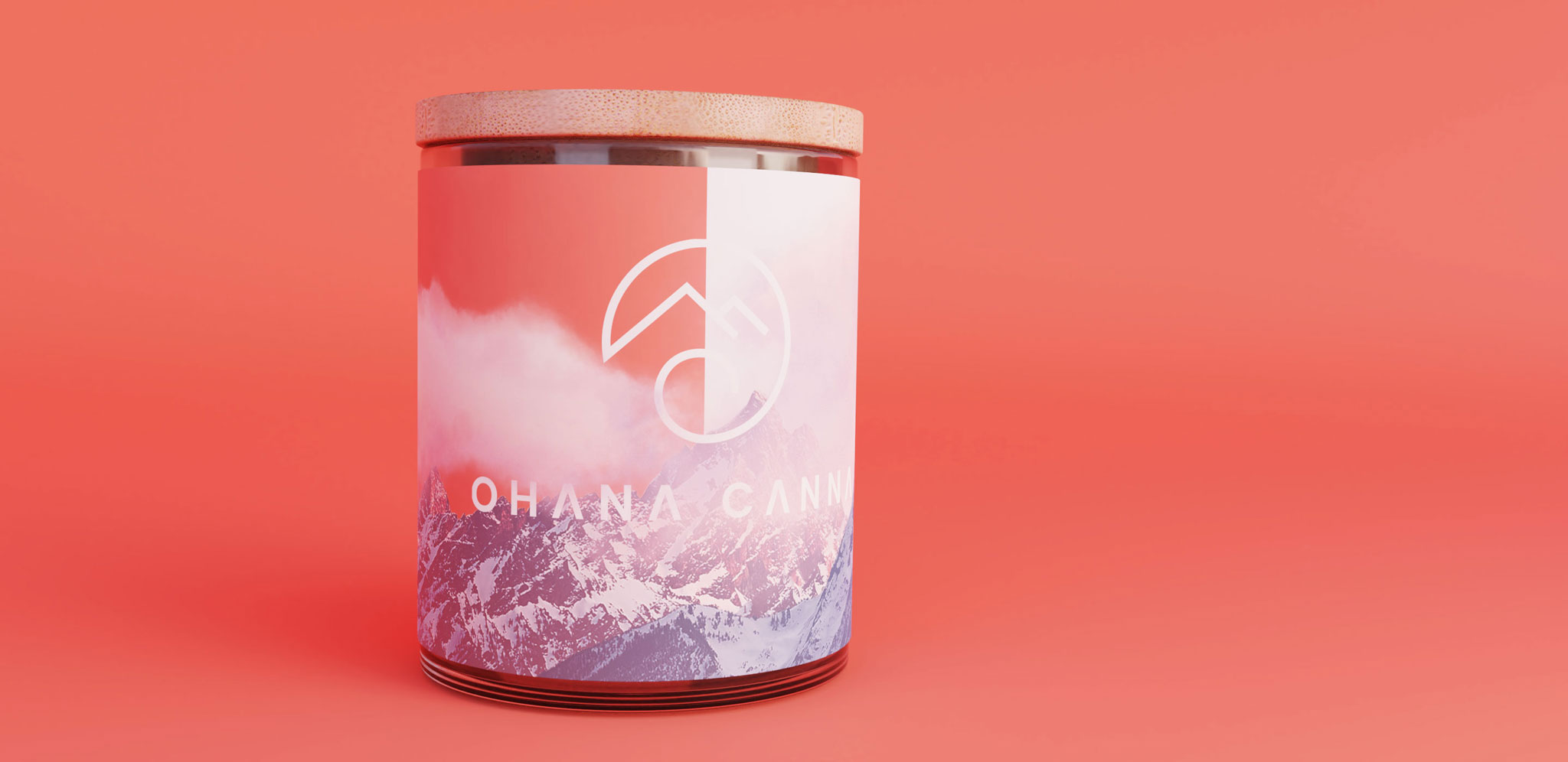
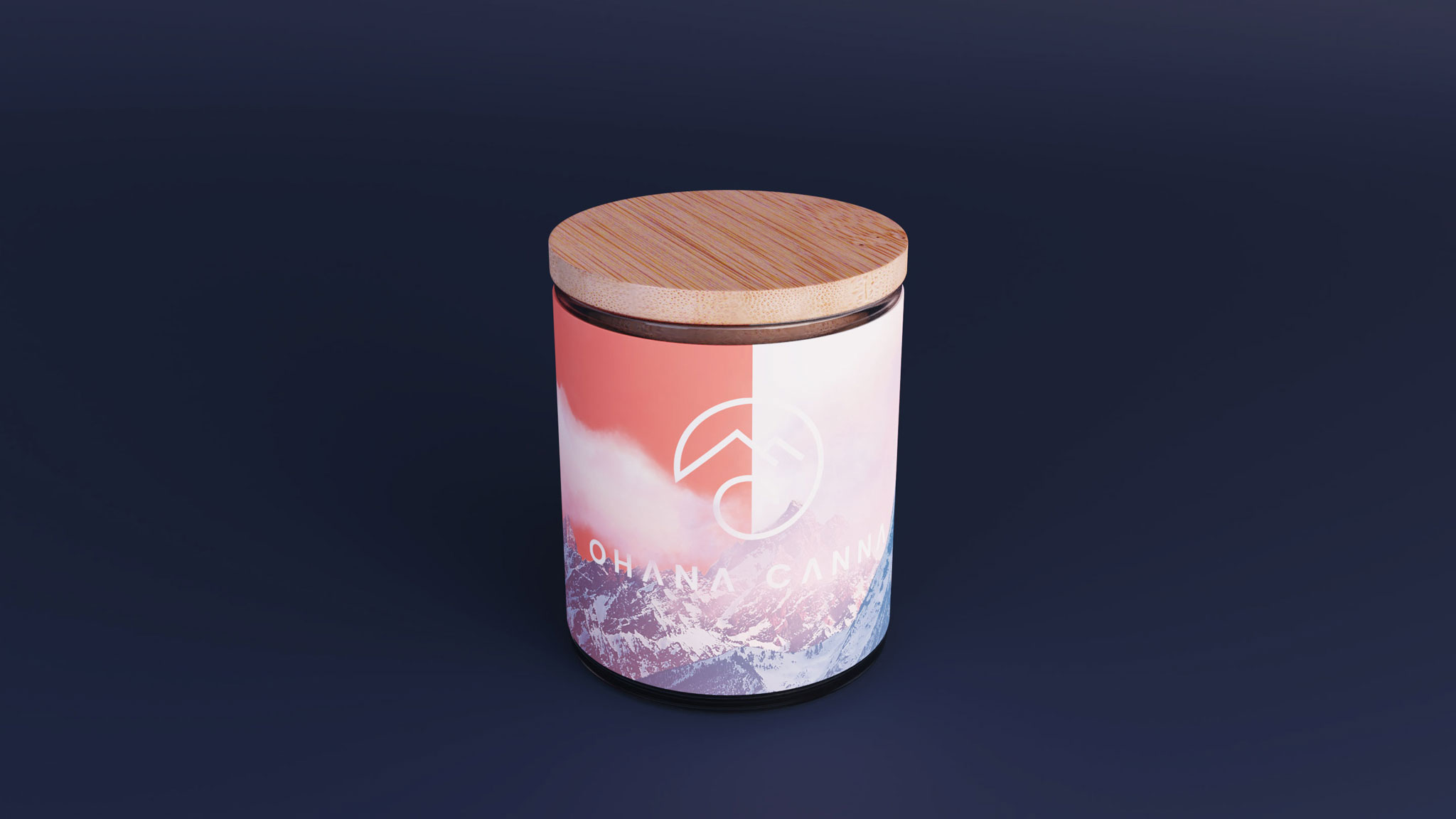
Creating a promotional label for cannabis dispensary samples
Just like all new marijuana brands, Ohana Canna needed to market to dispensaries before they could turn their attention to consumers. We helped them create a simple promotional label that could be used on jars of sample product given to potential dispensary partners.
Marketing Materials
All the essentials for marijuana brand launch & promotion
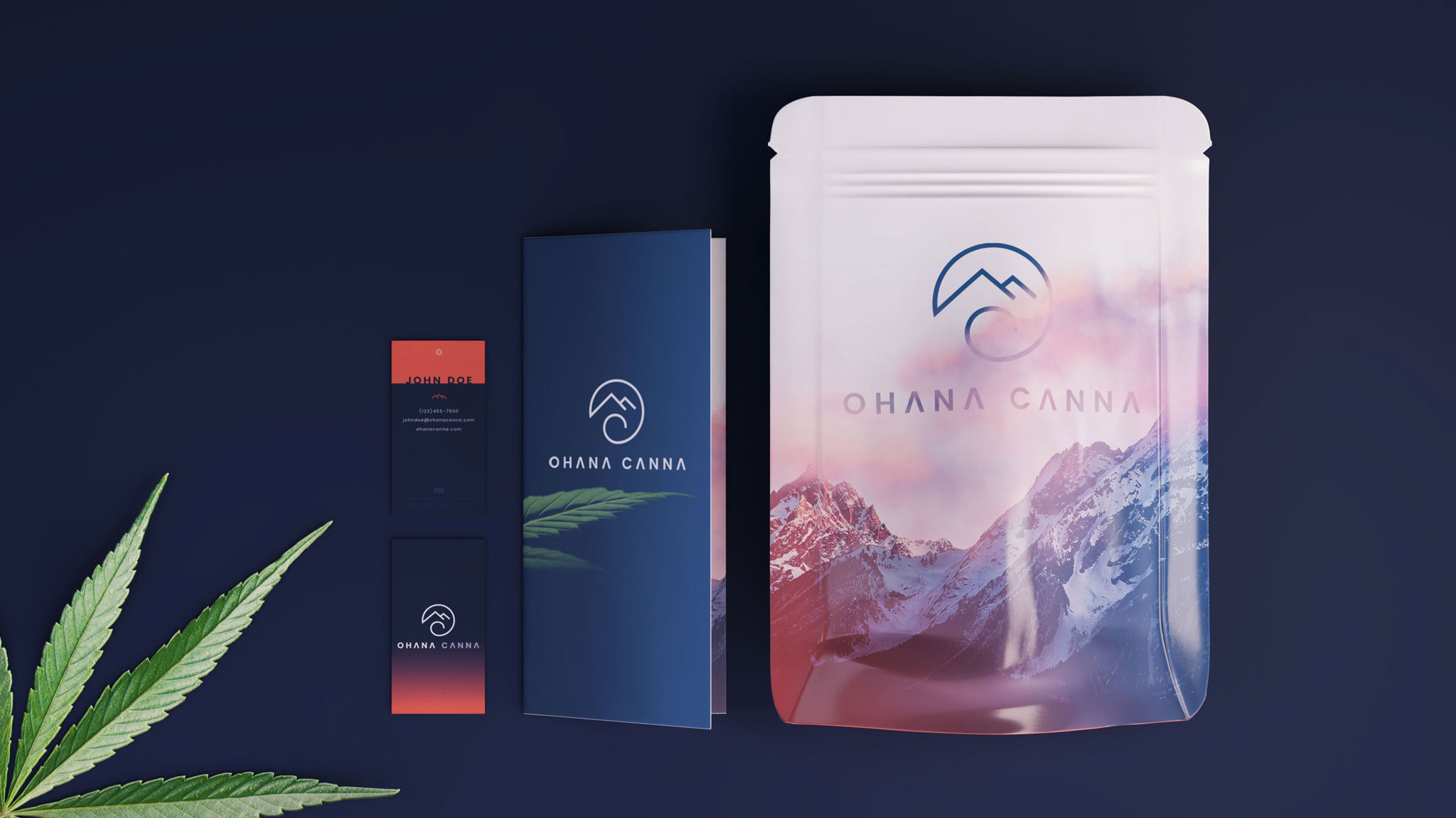
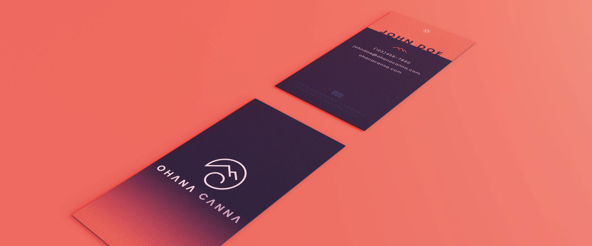
Aside from product samples, a new cannabis brand needs to educate and captivate potential buyers over all aspects of the business. Ohana Canna asked us to design the full set of brand materials that would be given to dispensaries, which included a business card design, educational brochure, and matching promo bag for everything to go in.

Website Design
One of our most unique cannabis website designs to date! The Ohana Canna site doesn’t include much advanced functionality, but what it lacks in bells and whistles it makes up for with interesting imagery, colorful elements, and subtle animations.


